Hey y’all—John Grimshaw here!
Welcome back to our 4-part Summer Series, where we’re looking at what’s working so far in 2025 so you can build momentum in Q3 and carry it into the holiday season.
Today, we’re focusing on conversation rate optimization (CRO).
I’m walking you through 3 CRO case studies from our agency that you can use to boost sales, profit and AOV—including:
- How we increased BOOM!’s AOV from $44 to $78 by taking a “meaningful swing”
- The simple page we used to lift Pretty Farm Girl’s conversions 22%
- And how we boosted conversions 16% for SafeSleeve with a few impactful UX tweaks
Here we go.
(And if you want to optimize EVERY stage of your customer journey—from engagement to acquisition to monetization—shop our Big Blowout Summer Sale where you can save sitewide, including 40% off our new “CRO Accelerator Bundle”!)
CRO: How to Create a Frictionless Customer Experience
First, I just want to say: CRO is not just about tweaking button colors—it’s about creating a frictionless customer experience.
It’s about looking at our pages, funnels, and every step of our customer journey to discover where customers are getting stuck and how we can keep them moving toward the next desirable action.
It’s an iterative, flowing process that looks something like this:
- Observation: Identify where customers are engaging (and where they’re not).
- Hypothesis: Propose a specific change and explain how it could drive improvement.
- Test: Implement your idea in an objective, measurable way.
- Results: Record the outcomes of your test.
- Takeaways: Draw conclusions based on how the results align with your hypothesis.
Take Meaningful Swings
Now, for billion-dollar companies, testing something small like button color is actually worthwhile. These brands get millions of site-views a day, so even the smallest improvements can lead to tons of new revenue.
But for sub-$10 million companies? These small tests are mostly energy sucks.
You want to focus on “meaningful swings”—i.e., big tests that can actually move the needle. That’s what I’m trying to give you in this post.
And what’s one of the biggest swings you can take? Testing your offer.
1. Optimize Your Front-end Offer for AOV (BOOM! Case Study)
Observation
When Ezra asked the Smart Marketer Agency to take over BOOM!’s ads in March, acquisition had become stagnant.
Their main offer was converting well and cost per acquisition was solid—but AOV was around $44, way below their historical $65–$70 range.
Hypothesis
By optimizing acquisition for AOV, we thought we could improve front-end numbers overall even if conversions dipped.
Test
We switched BOOM!’s front-end offer from a single product back to a proven bundle, while testing multiple landing pages with the same traffic sources.
Control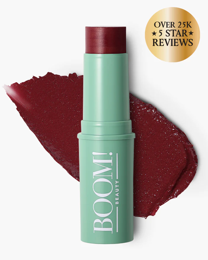 |
vs. | Variation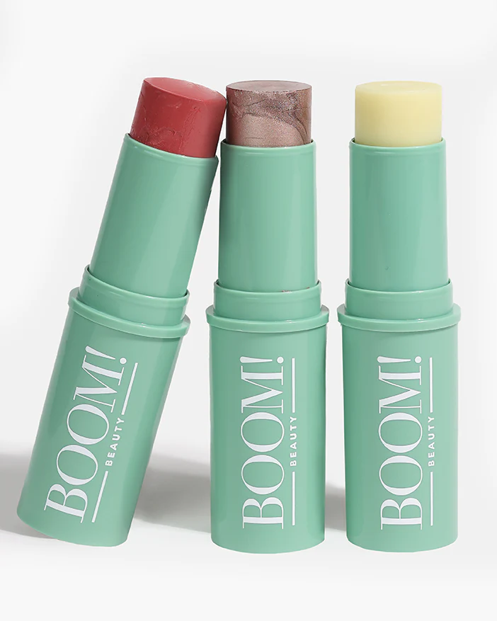 |
Results
- AOV jumped to $78 (+77%)
- New customers from Meta increased 20%
- And CPA increased slightly, while first-order profitability soared
Takeaway
If you’re struggling to acquire customers profitably, try optimizing your front-end offer for AOV.
(You can only drive CPA down for so long. Eventually, it’s worth trying to drive profit per order up.)
You can test:
- Bundles (like we did)
- Cart bumps
- Upsells, including post-purchase upsells with a tool like OneClickUpsell
And if you test a bundle, you DON’T need new creative—you can just route your existing ads to a secondary landing page with the bundle offer.
2. Simplify Pages for Faster Buying Decisions (Pretty Farm Girl Case Study)
Observation
We’ve worked with hundreds of brands, and a common mistake we see is ecommerce pages that are trying to do too much. These pages are designed to serve everyone instead of focusing on high-intent visitors.
When we started working with Pretty Farm Girl, we saw exactly that.
Hypothesis
We felt by simplifying the product pages they were using for cold traffic, we could remove distractions and significantly increase conversions.
Test
We helped PFG design an “Evergreen Discount Category Page” with a cleaner layout, including:
- Cleaned up top nav: removed external links, kept logo for trust
- Made nav links scroll to sections on the page (e.g., testimonials)
- Removed other distractions like product comparisons
Then, we implemented a few best practices we’ve seen working with other clients on this kind of page:
- Added a 5–10% discount
- Focused each page on a single category (e.g., beef tallow products) with clear benefit headlines
- And added badges and text callouts that spoke to customer segments (“Great For Health-conscious Moms!”)
Here’s the new design:

Results
Takeaway(s)
By removing friction from the buying process—and by highlighting a single category to give the offers more context and focus—we helped speed up buying decisions which led to a big increase in sales.
Meanwhile, the badges and callouts enabled customers to self-select a solution that worked for them, and the discount added an extra bit of incentive to buy now.
3. Test Headlines & Focus on UX Improvements (SafeSleeve Case Study)
Observation
Ezra recently bought into a cool new company called SafeSleeve, which sells phone cases that protect the user from radiation.
When we looked at their ads, we saw most traffic was going to SafeSleeve’s homepage. That’s usually not ideal for conversion, but was actually performing pretty well (and at the time it was the only page they were sending traffic to).
Still, we felt we could optimize their homepage while they built out their offer system.
Hypothesis
We felt that by improving the UX on their homepage to make it more user friendly, we could increase conversions without building a new page.
It was a simple plan, but the execution was actually pretty cool.
Test
- Headline: We changed the headline from “5G EMF Radiation Protection” to “Lab-Tested EMF Protection for Everyday Devices”
- “Card-ification”: We separated device categories into clickable cards with distinct borders and hover effects
- “Button-ization”: We redesigned buttons to look more clickable (rounded corners, hover animations)
Here’s the new design:

Result
- 16% increase in conversion rate.
Takeaway
The new headline mentioning “Lab-tested” increased trust and authority.
Headlines are a great thing to test, by the way. They’re easy to change and can be very impactful (remember, take “meaningful swings”) because so many users see them vs. other elements further down the page.
Meanwhile, the UX improvements made the site more intuitive for users to interact with.
Want to Optimize Your Entire Customer Journey?
These tips were just a few of the high-impact CRO tests that have worked for our clients so far in 2025.
If you want to optimize EVERY stage of your customer journey—from engagement to acquisition to monetization—shop our Big Blowout Summer Sale where you can save sitewide, including 40% off our new “CRO Accelerator Bundle”.
This bundle comes with:
- Smart Ecommerce – Ezra’s full system for building and scaling ecom brands, featuring the culmination of 15+ years of testing his pages, emails and other marketing tactics
- “Build a Perfect Product Page” Blueprint – With our brand-new blueprint, you can optimize the most valuable pages on your size with the help of the CRO king, Kurt Elster
Check out our new CRO Accelerator Bundle, and save sitewide for a few more days during our Summer Sale!
–John
